Python for Data Science
A Crash Course
Visualizing Data With Matplotlib and seaborn
Khalil El Mahrsi
2025

What is Data Visualization?
- Data visualization is both a science and an art
- Represent data accurately, without being misleading or wrong...
- ... in an aeasthetically pleasing manner
Aesthetics
- A data visualization maps data values into quantifiable features (aesthetics)
- The choice of aesthetics depends on
- The type of data (quantitative, categorical, ordinal, ...)
- The main message you want to deliver

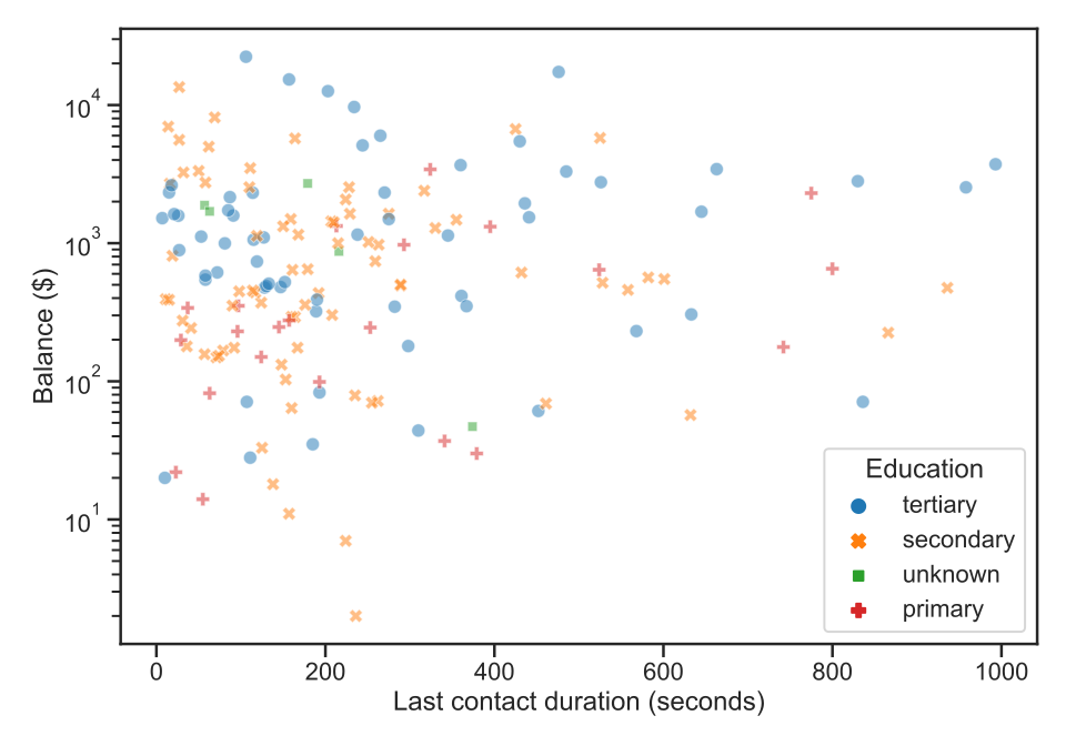
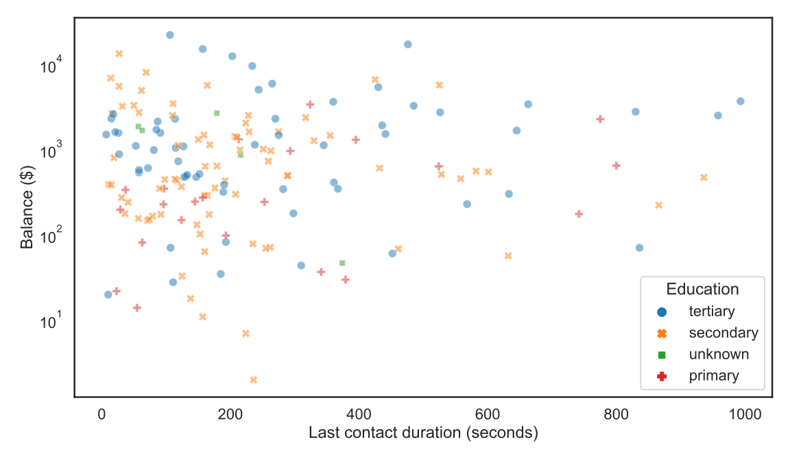
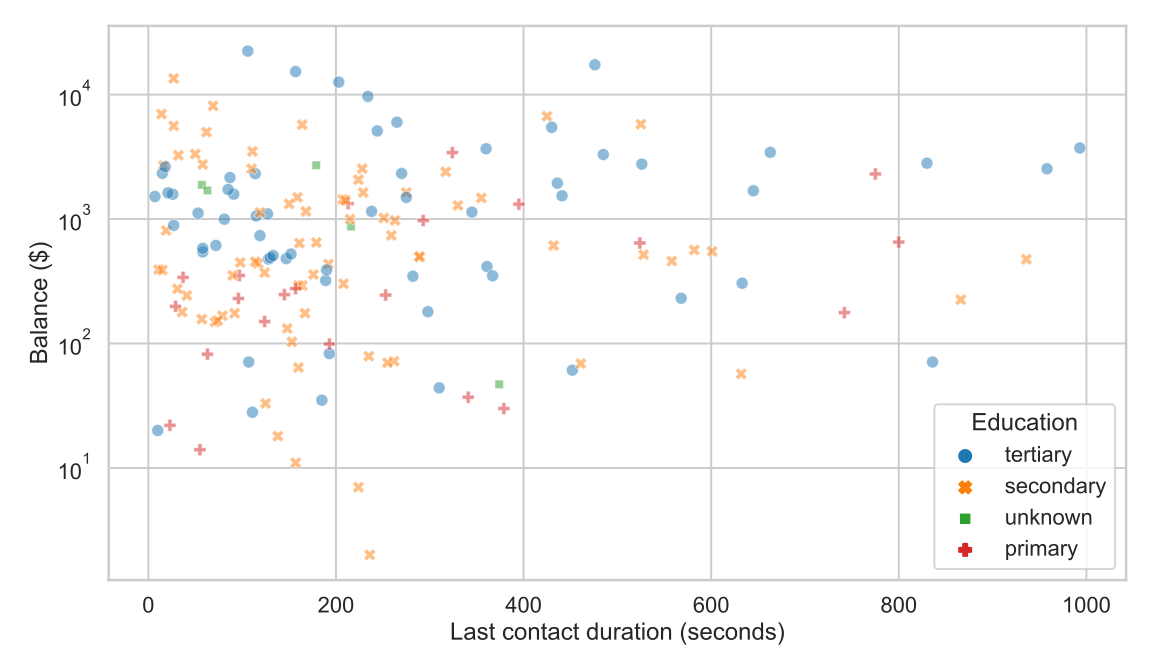
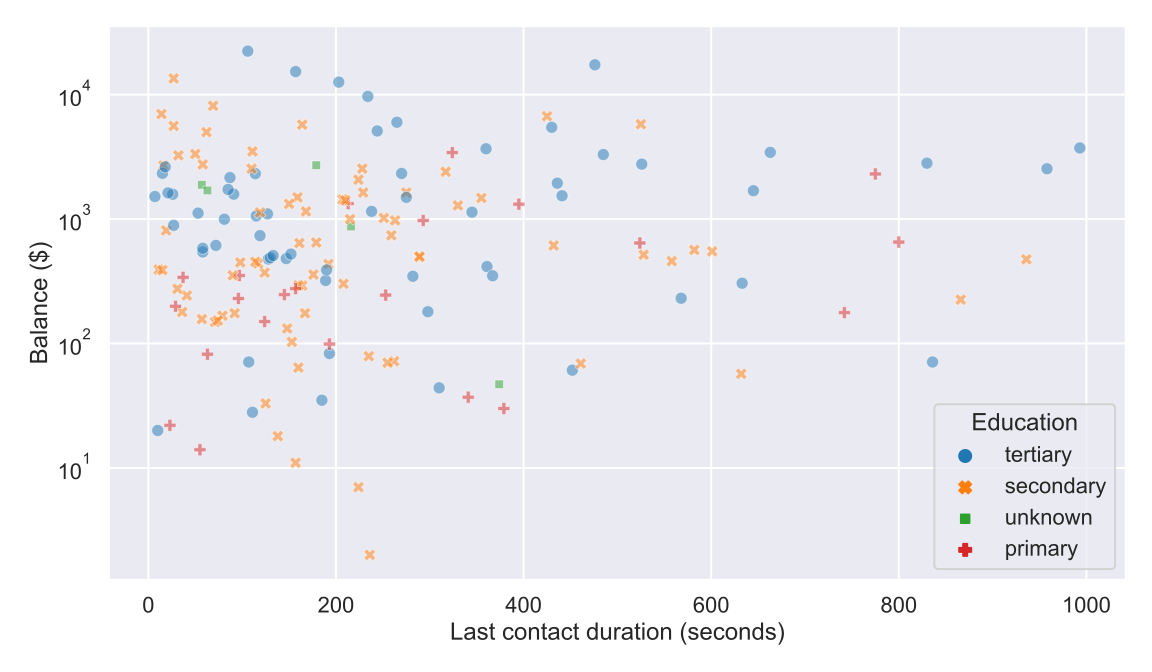
Aesthetics (Example)
-
The position along the x axis represents the
durationvariable -
The position along the y axis represents the
balancevariable (logarithmic scale) - The shape represents the
educationvariable -
The color represents the
educationvariable (redundant coding)
Working With Colors in Data Visualizations
- Three use cases
- Distinguish between groups of observations
- Represent data values
- Highlight specific observations
- The choice of color is different depending on the intended use
- Discrete or continuous?
- Diverging, sequential, or qualitative palette?
Python Data Visualization Packages
- The Python ecosystem offers a plethora of data visualization packages
- Packages for making static data visualizations
- Matplotlib
- seaborn (builds on top of Matplotlib)
- ...
- Packages for making interactive data visualizations
Even recent versions of pandas provide
basic plotting capabilities.
Installing and Importing Matplotlib and seaborn
Installing Matplotlib and seaborn with conda (recommended)
% conda install matplotlib seabornInstalling Matplotlib and seaborn with pip
% pip install matplotlib seabornImporting Matplotlib and seaborn (in Python scripts or notebooks)
>>> import seaborn as sns
>>> import matplotlib.pyplot as plt
Example Data Visualization With seaborn and Matplotlib
sns.set_style("ticks") # set seaborn style
sns.set_context("talk") # set seaborn context

fig, ax = plt.subplots(figsize=[8, 5]) # set figure size

plot = sns.scatterplot(
    data=bank_sample,
    x="duration", # variable to map to x axis
    y="balance", # variable to map to y axis
    style="education", # variable to map to shape
    hue="education", # variable to map to color
    alpha=0.5 # transparency
)
plot.set(yscale="log") # use log scale for y axis

# set axis and legend titles
plt.xlabel("Last contact duration (seconds)")
plt.ylabel("Balance ($)")
plt.legend(title="Education")

plt.savefig("dataviz_example.svg") # save to disk
Visualizing Distributions
- Visualizing a variable's distribution can be very helpful
- Understanding the central tendency, dispersion, range of values, ...
- Checking if it seems to follow a given probability distribution
- Spotting heavy skews and outliers
- ...
- Mainly two types of visualizations
- Histograms
- Density plots
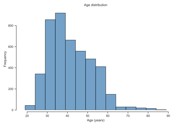
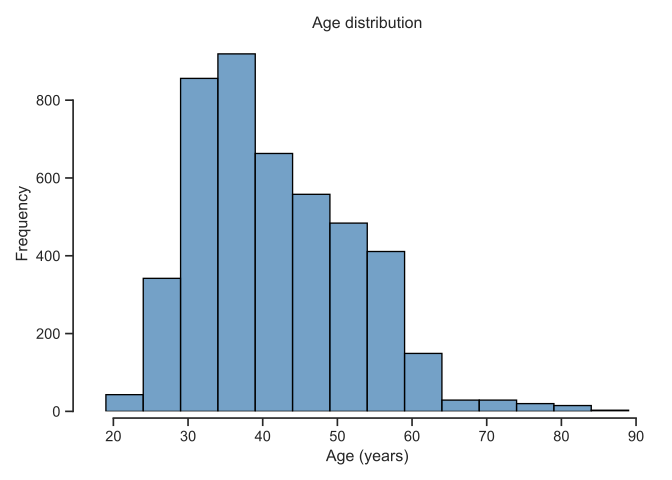
Histograms
-
Histograms can be plotted using the
histplot()function (cf. documentation)
fig, ax = plt.subplots(figsize=[7, 5])

sns.histplot(
    data=bank,
    x="age",
    binwidth=5, # 5-year bins
    color="steelblue",
    edgecolor="black")

ax.set( # set plot title and axis labels
    title="Age distribution",
    xlabel="Age (years)",
    ylabel="Frequency"
)

sns.despine(offset=5, trim=True)

plt.savefig("histograms.svg")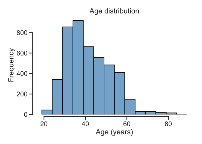
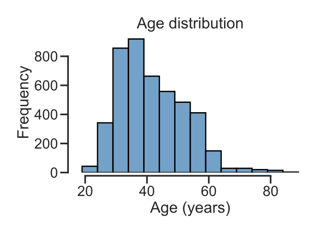
Density Plots
- Increasingly popular alternative to histograms
- Plot the underlying distribution of the data using a continuous curve (estimated using a kernel density estimation method)
-
Can be plotted using the
kdeplot()function (cf. documentation)
fig, ax = plt.subplots(figsize=[7, 5])

sns.kdeplot(
    data=bank,
    x="age",
    color="steelblue"
)

ax.set(
    title="Age distribution",
    xlabel="Age (years)"
)

sns.despine(offset=5)

plt.savefig("dataviz-density.svg")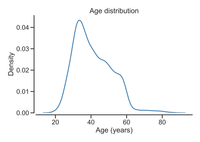
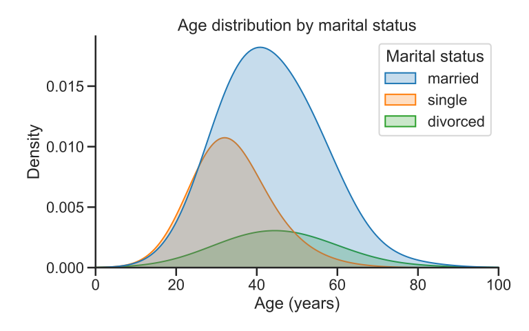
Comparing Multiple Distributions
- Useful for comparing how a quantitative variable is impacted by another categorical variable
- Can be done using a multitude of plot types
- Histograms (not the best)
- Density plots
- Box plots (
boxplot()) - Violin plots (
violinplot()) - Usually handled by mapping the categorical variable to a color and/or an axis
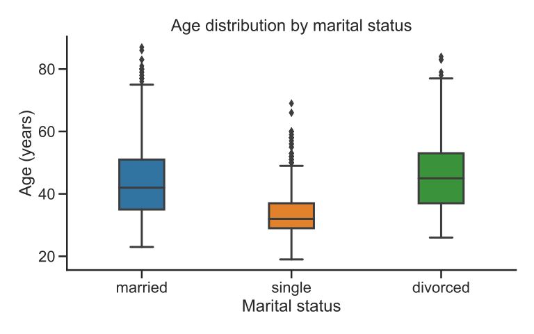
Box Plots
- Box plots visualize
- The median (line in the middle of the box)
- The first and third quartiles (the limits of the box)
- The minimum and maximum excluding outliers (wiskers outside of the box)
- Outliers (dots outside of the wiskers)
-
Can be plotted using the
boxplot()function (cf. documentation)
fig, ax = plt.subplots(figsize=(8, 5))
sns.boxplot(
data=bank,
x="marital",
y="age",
width=.3
)
ax.set(
title="Age distribution by marital status",
xlabel="Marital status",
ylabel="Age (years)"
)
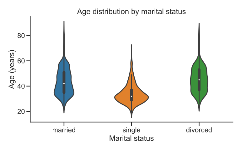
sns.despine()Violin Plots
-
Violin plots can be plotted using the
violinplot()function (cf. documentation) - Similar role to box plots (but more attractive)
- Plotted using kernel density estimators (like density plots)
- Can be misleading if sample size is small, ...
fig, ax = plt.subplots(figsize=(8, 5))

sns.violinplot(
    data=bank,
    x="marital",
    y="age",
    width=.5
    # hue="marital"

)

ax.set(
    title="Age distribution by marital status",
    xlabel="Marital status",
    ylabel="Age (years)"
)

sns.despine()
Visualizing Interactions Between Quantitative Variables
- Plotting multiple quantitative variables at once is useful for identifying how the influence each other (e.g., linear relationship, ...)
- Mainly done with scatter plots (
scatterplot()) - Color, shape, and size can be used to identify different subsets
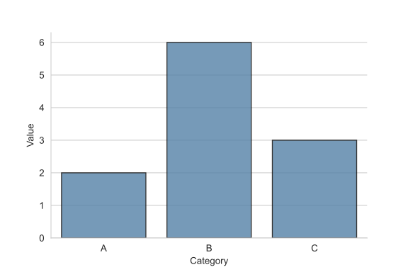
Visualizing Amounts With Bar Plots
- Bar plots visualize
- Magnitudes of quantitative values (e.g., totals, counts, ...) ...
- ... for a set of categories of a qualitative variable (e.g., marital statuses, education levels, ...)
-
Can be plotted using
barplot()(cf. documentation) -
When plotting counts, use
countplot()instead (cf. documentation)
fig, ax = plt.subplots(figsize=(8, 5))

sns.countplot(
    data=bank,
    x="marital"
  )
ax.set(
  title="Number of clients per marital status",
  xlabel="Marital status",
  ylabel="Count"
)

sns.despine()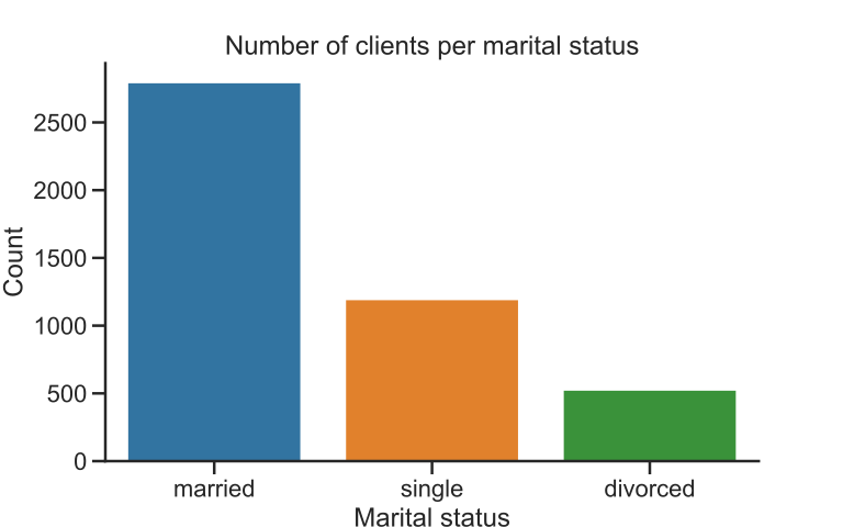
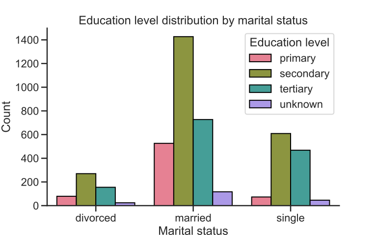
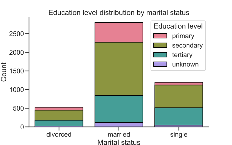
Grouped and Stacked Bar Plots
- Grouped or stacked bar plots can be used when you are interested in plotting the quantities for two categorical variables at once
- One categorical variable is mapped to an axis
- The second categorical variable is mapped to color
seaborn Theming
-
Figures can be easily styled using seaborn's
set_theme(),set_style(), andset_context()functions (cf. documentation)
sns.set_style("white")
...
sns.set_style("whitegrid")
...
sns.set_style("dark")
...
sns.set_style("darkgrid")
...
seaborn Theming
-
Figures can be easily styled using seaborn's
set_theme(),set_style(), andset_context()functions (cf. documentation)
sns.set_context("paper")
...
sns.set_context("notebook")
...
sns.set_context("talk")
...
sns.set_context("poster")
...
Useful References
Creative Commons
Attribution-NonCommercial-ShareAlike 4.0
International Public License
(CC BY-NC-SA 4.0)
Python for Data Science A Crash Course Visualizing Data With Matplotlib and
seaborn Khalil El Mahrsi 2025